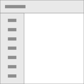

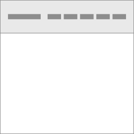


Navbar
Navbar
Navbars come with built-in support for a handful of sub-components. Here’s an example of all the sub-components included in a responsive light-themed navbar.
Brand
Adding images to the .navbar-brandwill likely always require custom styles or utilities to properly size.
Nav
Navbar navigation links build on our .navoptions with their own modifier class and require the use of toggler classes for proper responsive styling.
Forms
Place various form controls and components within a navbar with .form-inline.
Text
Navbars may contain bits of text with the help of .navbar-text.
Color schemes
Theming the navbar using theming classes and background-color utilities. Choose from .navbar-lightfor use with light background colors, or .navbar-darkfor dark background colors. Then, customize with .bg-*utilities.
Container
Wrap a navbar in a .containerto center it on a page or add one within to only center the contents of a fixed or static top navbar.
Togglers
Navbar togglers are left-aligned by default, but should they follow a sibling element like a .navbar-brand, they’ll automatically be aligned to the far right. Reversing your markup will reverse the placement of the toggler.
Toggle on left
External Content
Sometimes you want to use the collapse plugin to trigger hidden content elsewhere on the page. It works on the id and data-target matching, that’s easily done!